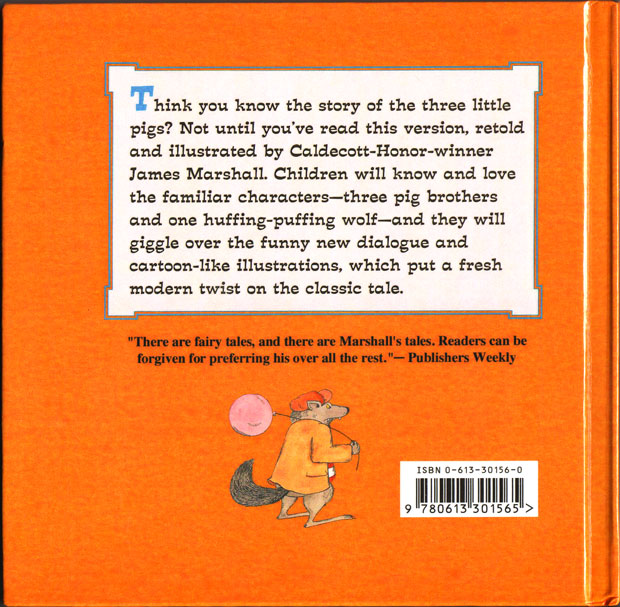
The only edition of James Marshall’s The Three Little Pigs (1989) currently in print has been vandalized by its publisher, Grosset & Dunlap. In reprinting the book at 8” x 8” instead of its original 8.5” x 10.5”, the publisher has truncated images, altered the layout, changed the typeface, and removed the final illustration.
Here’s the original:
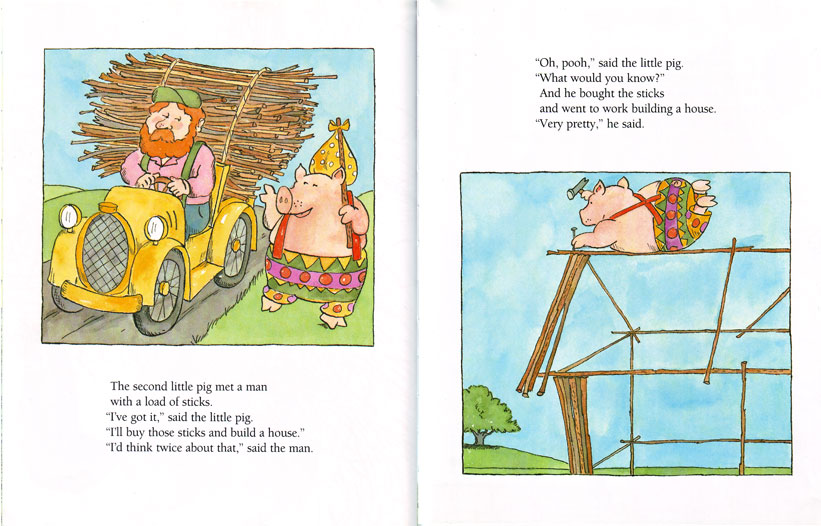
Here’s the new version, which crowds the layout, cramping Marshall’s watercolors:
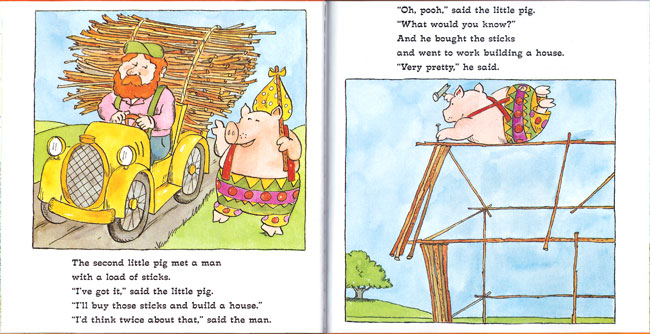
Making the text difficult to read, Grosset & Dunlap also changed the elegant Berkeley serif font to what appears to be the title typeface from Sid and Marty Krofft’s Lidsville (1971-1973).
 |
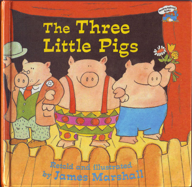 |
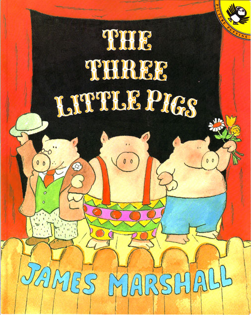
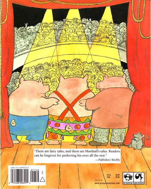
And the final image, in which the three pigs take their bow (on the back cover), has been removed entirely. This is a shame because the front and back cover frame the tale as a theatrical performance. It reminds us that no pigs were harmed in the making of this story; they were performing a production of The Three Little Pigs.
 |
 |
In one sense, what Grosset & Dunlap has done is not unique. Publishers do alter children’s books to make them fit a different format. When they retain the original design sense, as in HarperCollins’ board-book version of The Carrot Seed, they minimize any sense of loss: the board-book Carrot Seed is still recognizably a work by Crockett Johnson and Ruth Krauss. However, when they remove text, change layout and design – as in Random House’s board book of Dr. Seuss’s ABC – we end up with a work based on the original, but a demonstrably different book. (For “L,” the original has “Little Lola Lopp. / Left leg. / Lazy lion / licks a lollipop.” The board book has only “Lion with a lollipop.”)
What’s baffling in the case of Marshall’s The Three Pigs is the impetus for the publisher’s mangling of his original. This is not a board book. It’s a “Reading Railroad” book, and I have no sense what mandates these books being sold in a tinier size.
The practice is of course also offensive. No one would suggest a slicing up a Rembrandt so that it would better fit in a particular gallery space. Presumably, the fact that the art is intended for children makes a publisher feel justified in mangling its aesthetics. Is the font intended to “kiddie-up” the text? What possible rationale can there be for letting some alleged “designer” (who appears to have no training in design) damage the work of an artist who is no longer alive to protest? No idea.
I wonder: Do Marshall’s heirs know that Grosset & Dunlap is defacing his artwork? If they don’t, could someone please notify them? And ask that they bring back the original work in its original format, please.

Libby
J. L. Bell
Philip Nel
Eric Carpenter
Pingback: Fusenews: Polar bear, polar bear, what do you see? « A Fuse #8 Production
Brian
cynthia marshall
Pingback: The Cricket in Times Square
Amy