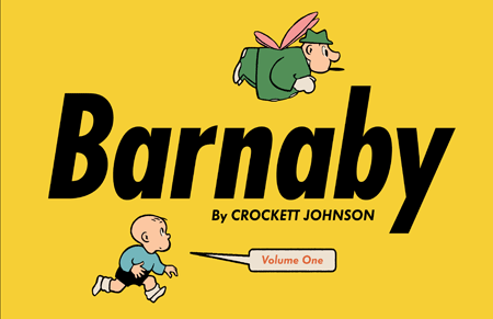
The book went to press earlier this month, and will be out in the spring. I can’t wait for you to see it. Crockett Johnson’s Barnaby Volume 1 is truly a thing of beauty.
If you read any books published by Fantagraphics, this last sentence will not surprise you. But in case you are not (yet) a Fantagraphics devotee, let me give you a little behind-the-scenes look at why this book looks so great. (If you can’t wait to see a few glimpses, please scoot on over to Fantagraphics’ post on Barnaby Volume 1: it includes images and Daniel Clowes‘ rough sketch for the cover.)
Fantagraphics is perfectionistic in all the right ways. At each phase of the process, Eric Reynolds – who is co-editing the Barnaby books with me – contacted me with specific questions. Most recently, at page-proofs phase, we talked about the layout of my essay, as well as those by Chris Ware and Jeet Heer. Dan Clowes put the epigraph for the first section of my essay in a Barnaby-style speech bubble. I thought: that looks cool. Might we try the same treatment for the other epigraphs? We did, and liked the result. Eric, Dan, and Fantagraphics designer Tony Ong also experimented with how to lay out my notes. We proofread everything many times, had conversations about grammar and word choice. Eric worked hard on getting the spacing just right on the back cover’s panels (visible, if too small to read clearly, on Fantagraphics’ post – and below). If these details sound boring to you, they really shouldn’t. This sort of keen attention to detail makes for a beautiful book.

Fantagraphics works with the best people. Daniel Clowes! Chris Ware! Jeet Heer! Dan designed the book to look as if it were designed by Crockett Johnson in the 1940s. When you look at (for example) the back cover, it does not look as if it was designed using contemporary software. The lines look hand-ruled because (I believe) they were hand-ruled. For the typeface, Dan used Futura because that’s the distinctive typeface of Barnaby — and, incidentally, of Ruth Krauss‘s The Carrot Seed, which Johnson illustrated & designed. Chris wrote a beautiful, insightful introductory piece on Johnson and Barnaby. I’m tempted to quote it here, but I think I’ll leave it as a surprise. I will say, though, that there are few comics creators who can speak as lucidly as Chris can about how comics work. I’ll also say that Chris’s piece will make you look at Harold (of purple crayon fame) in a new way. And… that’s all I’ll say. Comics scholar Jeet Heer’s introduction features the best description of Mr. O’Malley (Barnaby’s fairy godfather) that I’ve ever read: “half-pixie and half-grifter, an otherwordly being most at home in low-life dives and gambling dens, raider of other people’s fridges and cigar boxes, an inept wizard whose magic only works intermittently and often with unintended consequences, a self-mythologizer whose account of his own past glories is an improbable farrago of tall tales, a rhetorician quick to smooth over any difficulty with rococo eloquence and irrelevant digressions.”
Fantagraphics – specifically, Eric Reynolds – communicated with me clearly and regularly. He was always clear, polite, and had the best interests of the project at heart. A great guy to work with. I’m delighted that we’ll be working together on volumes 2 through 5! (We’re collecting the full ten-year run of Barnaby, 1942-1952, with two years in each volume.)
Finally, we could not have done this without the help of collectors who loaned us their newspapers or scanned strips – the Smithsonian, Harvard University, and Charles Cohen, in particular. So. Thanks to them! Note to the curious: a complete collection of old newspaper strips are not just lying around in an archive. You have to go looking for them. It’s an enormous amount of work, and is one of the reasons Volume 1 took so long. The other is Fantagraphics’ admirable perfectionism.
So. This spring. Barnaby Volume 1. Get it!

Grateful Barnaby-seeker
Philip Nel