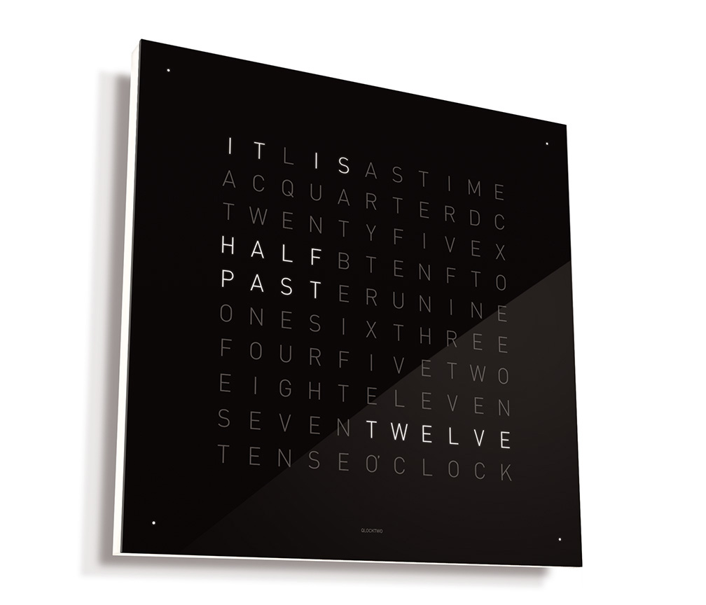
Biegert & Funk’s QlockTwo is a beautifully designed clock. I’ve an image below, but before reading further you might experience it for yourself (on B&F’s webpage).
 The clock contains the right number of letters to announce the time in a complete sentence. Its sans serif typeface is easily legible, telling us that “IT IS TWENTY TO TWO,” and then “IT IS A QUARTER TO TWO” in crisp, white letters (it measures in five-minute increments). But what I especially like is the way it slows down the experience of time, converting something precise into something precise enough. I also enjoy the gentle irony of having an iPhone app that translates the digital precision of 2:16 p.m. into the comfortable analog, “IT IS A QUARTER PAST TWO.”
As the iTunes reviews indicate, it would be great if one could make this app the phone’s background. As reviewer JLSchend notes, “I see the time on the wallpaper long before I open the app.” However, the point of the QlockTwo app is not instant access to the time. The point is to provide an aesthetically and emotionally different experience of time.
Digitally rendered time, with numbers and colons, is exact, keeping track of each second as it slips away. The second hand on a clock face also tracks time’s relentless dissipation, but, without numbers marking each second’s passing, clock time seems to move with less insistence than digital time. The Qlock’s rendering of time as text, however, abstracts the temporal from both the spatial (clock face) and digital (numbers and colons). Time’s past and future are not mapped as they are on a clock face. And the absence of a digital timepiece’s swiftly accruing seconds gives a feeling of slowness, of being in the present.
Unlike other timepieces, the Qlock does not emphasize time passing. Instead, it narrates the gradually changing present.
Read More


 The clock contains the right number of letters to announce the time in a complete sentence. Its sans serif typeface is easily legible, telling us that “IT IS TWENTY TO TWO,” and then “IT IS A QUARTER TO TWO” in crisp, white letters (it measures in five-minute increments). But what I especially like is the way it slows down the experience of time, converting something precise into something precise enough. I also enjoy the gentle irony of having an iPhone app that translates the digital precision of 2:16 p.m. into the comfortable analog, “IT IS A QUARTER PAST TWO.”